

It's Jamie Meares' bedroom from the premier issue of High Gloss that I shared with y'all here. I don't even mind her brown bedspread the way I am loathing mine right now.
I think I have found a color that approximates the soft greenish blue-grey: Benjamin Moore's Crystalline from their Affinity line. In case it doesn't call out to you quite the way it does to me, it's the swatch on the bottom right.
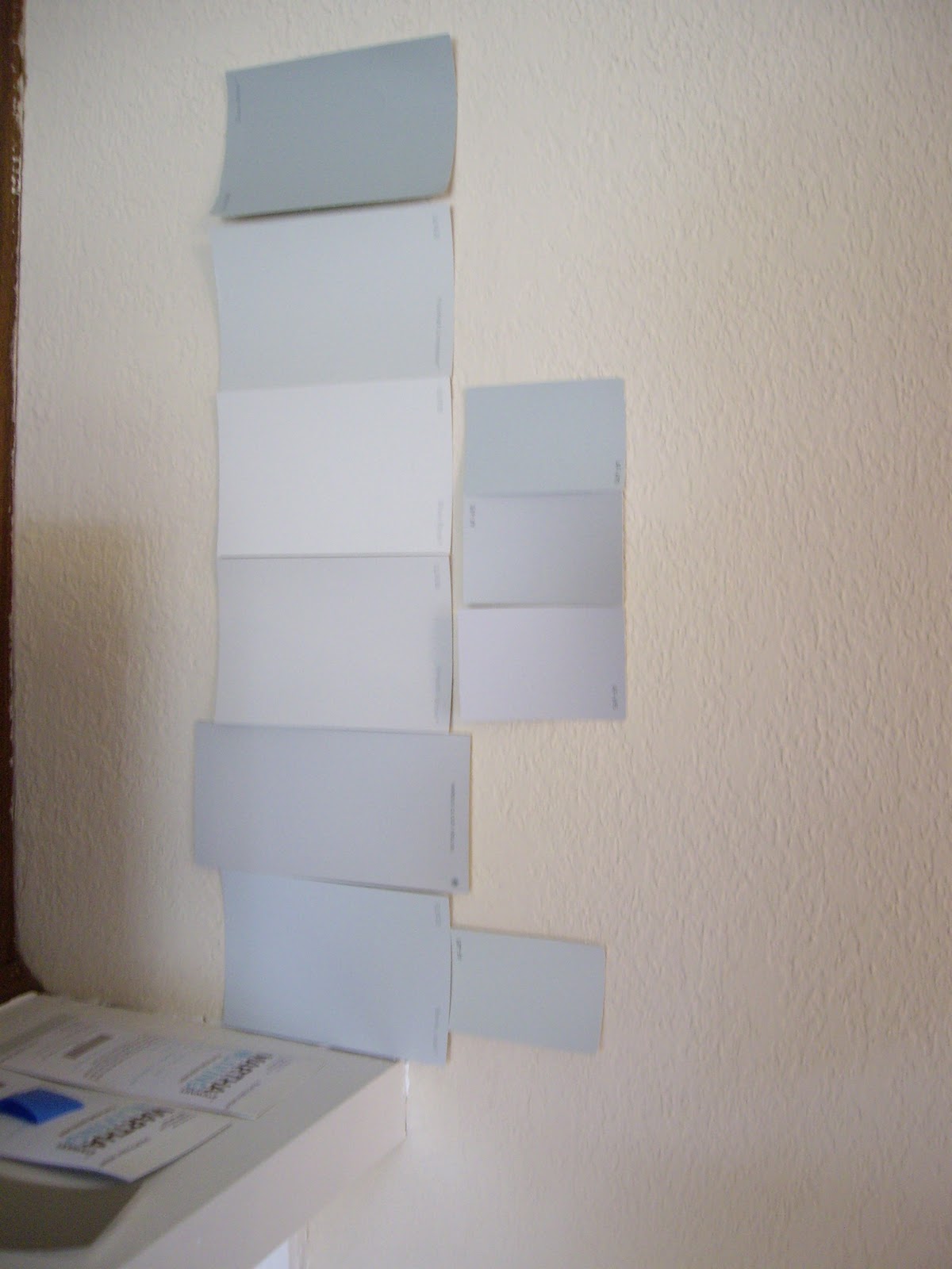
Here's a close up. It's on the right, and the color of our old bedroom, Glidden's Barely Jade, is on the left. I really like that it is more green than Barely Jade.

I still want to paint a larger swatch on the wall just to make sure that this is *the* color, but I think I am really honing in on it.
Even though my inspiration room is rocking brown bedding, I am hoping to change ours up after almost 6 years. I have my eye on some patterned bedding, and I also ordered some fabric swatches for pillows, window treatments, and possibly a headboard, but I am really struggling to figure out how all the pieces will fit together. They definitely can't all go together!
Here's what I keep coming back to: the Wakeful Ikat sheet set from Anthropologie.

With sheets this wild, we would definitely want to pick a more toned down duvet. I was thinking something solid and a bit textured, like linen, possibly in grey. I could make a couple of throw pillows with this fabric, or even some curtain panels.

But these curtain panels from West Elm would look swell too...

Or maybe this same Ikat pattern in a different colorway (for sale as fabric by the yard or custom upholstered on a headboard from West Elm), would look pretty sweet on a DIY headboard with this shape.

Perhaps a solid, textured fabric would be easier on the eyes and better weather my ikat (and chevron) mania...

Here's where it starts getting complicated. There is also this duvet cover from West Elm, which caught my eye back in the fall when it first debuted.

This fabric, from Dwell Studios, would make a lovely complement to the geometric pattern of the duvet.

I envision it as either window panels, or even better, as the fabric for the same DIY headboard mentioned above.
But just to complicate things further, I have also been contemplating bringing in more inky blues, a la my inspiration photo. Perhaps something like this comforter (not the whole set)...

We have paneling to rip out and walls to texture and paint before I start buying/sewing the soft goods, but what are your thoughts? Am I headed in the right direction? Which combo is calling out to you?


I love your ideas. Here's a combo that I would love, personally. Ikat sheets, a comforter with one of those lighter blues/aquas in the sheets, and a neutral colored headboard with a rough texture, linen or raw sink or something...Btw, I think the reason I love the Ikat so much is bc it looks like a pretty inkblot, Rorschach-esque.
ReplyDelete