Showing posts with label paint. Show all posts

Tuesday, September 20, 2011

Let the Painting Begin!

The walls in the entry and dining room are FINALLY done. They are beautifully smooth and ready to be adorned with a fresh coat - or two - of paint. So paint I did. I got a bit of a late start on Sunday afternoon, so I only was able to do one coat of paint in the entry, but man, is it looking sweet!


I went with Sherwin Williams Modern Gray, which I color matched to Glidden Flat Interior Paint. (I went with Glidden because it is low VOC and inexpensive; I had wanted to go with Olympic, which is no VOC, but it is twice the cost of Glidden and I would have had to drive 45 minutes each way to the nearest Lowe's, which would have meant waiting till next weekend to bust out the brushes and rollers. I know you are wondering, "What's another week at this point?" But I was just too eager to get going after waiting so long.)

The coverage is definitely blotchy, so it will need at least a second coat. I took a gamble by deciding not to prime the walls first or get a built in primer, and I am glad it worked out. The coverage after the first coat may not be perfect, but it's pretty typical of what one coat of paint looks like. Whew!

The color is really soothing. It's not too light and not too dark; it's gray, but it has brownish undertones, so it is not an icy gray at all. (All the bluish gray swatches that I put up on the wall looked so frigid and this is really close to Berkshire Beige, the color I stumbled upon in Healdsburg that I fell for.) I dare say it's a warm grey, which is what I was shooting for.


I can't wait to see a second coat and get a feel for the space once we paint the dining room too this weekend. I am hoping I can finish up both coats this weekend, and do the ceiling the following weekend so I can put my house back together... and move forward with the skim coating in the living room.

Speaking of the ceiling, I am still not sure what I want to do up there. Should I cut Modern Gray by 50%? Or will that be too dark? Should I go with a white? Another color? Any suggestions? As usual, I want an answer now, but I think I will have to wait and see until that second coat dries.

Tuesday, July 5, 2011

The Perfect Paint Color...Maybe.

I hope you all had a wonderful and relaxing 4th of July weekend! We sure did; we spent it up in Healdsburg with friends, and it truly couldn't have been better. I will post about it this week (hopefully tomorrow), once I get my pics uploaded.

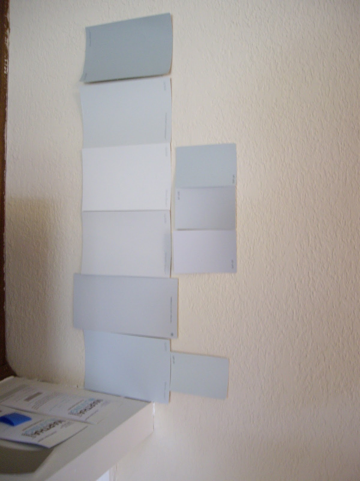
Before leaving for Healdsburg though, I threw a few more paint samples up on the wall, and I *might* have found the perfect color.

Just as a reminder, here's my inspiration photo.


Now here are the paints that I am happy with:


They are the ones on the left side of the picture (past and below the darker taupe color). Hard to see, I know, thanks to my crappy camera so here are some more shots.

In all the pics below, the colors I like are on the right.


The two colors, which are almost identical, are both from Sherwin Williams. Modern Grey is on the top, and Popular Grey is on the bottom. Of course I like Modern Grey, and Ryan likes Popular Grey (but he is willing to let me have my way since the colors are so similar).

Just when I thought I was firmly decided on Modern Grey, then I stumbled into the coolest store in Healdsburg, 14 feet, and fell for their putty colored showroom.


The owner was kind enough to divulge the color: Benjamin Moore's Berkshire Beige. (How cool is that 7 Deadly Sins plate wall, by the way?) So now I feel compelled to add a 9th color to the walls. The living areas are seriously starting to look like a patchwork quilt.

Do I have a problem? Is it time to call the game and just pick a color already? What are your thoughts?

Monday, June 20, 2011

Back to the Drawing Board?

I bit the bullet this weekend and painted some paint swatches up on the entry, living room, and dining room walls.

Here's what I am working with right now:


Clockwise from top left is: Grey Owl (Benjamin Moore), Smooth Stone (Glidden), Whetstone Grey (Martha Stewart), and Moonshine (Benjamin Moore). This is where I really wish I knew Photoshop so I could add the names of the different paints directly onto the pic. Someday.

I started with just Grey Owl and Moonshine, which were the front runners. Only here's what they looked like once on the wall.


They turned out to be more blue than the true, warmish grey that I am looking for. (Grey Owl is on top, Moonshine is below.)

I mean, I seriously thought I was going to end up with this:

Pic from House Beautiful

I thought that maybe the colors just weren't reading correctly because they are surrounded by the warm, peachy Navajo White; colors can change drastically depending on what they are paired with. (You can get a sense of what I am talking about below, but the colors aren't reading true and are hard to see because the camera sucks.)


However, I decided to error on the side of caution since I was really disappointed and we are talking about painting 3 substantial rooms and two hallways the same color. So back to Home Depot I went to get some paint samples that I had had taped up on the wall at various points. At $2.99 a pop, it was money well spent.

I added Smooth Stone on the left, with Whetstone Grey right below it, and I painted swatches in the three spaces that will be most impacted:

The entry...


The dining room (with the two new colors now on the right, just to be confusing)...


and the living room (also on the right).


I am still not sure if I have found *the* paint, but I am leaning toward Smooth Stone (in the upper right in the last two pics). I am worried it might be a bit dark when painted in an entire room, but the Whetstone Grey below it is definitely too light and its purple-y undertones will just not work for me.

What do you think? Are any of these paint colors calling out to you? Or do you know of any tried and true grays that I should slap up on the wall? I am paralyzed by indecision, and I worry I might have 20 swatches painted up there before I finally make up my mind! Help.

Wednesday, June 1, 2011

A Touch More of Grey

So the painting of the living room/dining room/kitchen combo, as well as the adjoining entry and hallway, is eminent! Summer is 3 short days away, and once I get a chance to catch my breath, you can bet that I will we climbing a rather large ladder to paint our open living area.

I know I went on and on about how I had found the perfect color, Whetstone Gray, here. But the more I looked at the paint swatch taped to the wall, the more I came to realize that it's really not so different from the current and dreaded Navajo White. Then I got to asking myself, "What's the point of dragging in and setting up scaffolding in the living room, only to end up with a color that is almost identical to the current color?" Seems like a whole lotta effort for a little payoff.

In case you can't remember, here's what the Whetstone Gray looks like:


It's the one smack dab in the center. See, it's just a touch more grey than the current wall color. (Sorry, I couldn't resist).

So back to the paint store we went to grab some more samples. This time I wanted something clearly more grey than greige, and I think I have hit upon some promising colors.

We are leaning heavily towards the lighter grey in the middle swatch, called Grey Owl. (The other lighter options are Smooth Stone by Martha Stewart on the top, and Moonshine by Benjamin Moore on the bottom. The darker swatches were never really on the table, but I was too lazy to cut them off.)

Here's a shot from a further distance so you can get more of a sense of color variation.


And if you are still not convinced, then check out this pic, which was featured in the newest issue of House Beautiful. (More on that tomorrow.)


It just so happens to be Grey Owl. I screeched when I turned the page and saw our paint color listed! I love the soft grey and how good it looks against both whites and blacks (like the sconces on either side of the bed), as well as pops of color (like the yellow flowers and green piping of the canvas bag on the ground). What do you think?

Monday, April 25, 2011

Repurposed Planters

When we moved into our house a little over two months (!) ago, there was this odd little bench hanging out by the hot tub...


(Look past the fuzzy behind.)

Oh, and the front door looked like this:


Now the bench has gone and the planters holding it up have been painted and moved to either side of the front door to make for a cheery entry.


These two hardwood planters were in bad shape; they were faded, falling apart, and the seen-better-days electric blue inserts had to go. The first step was getting new inserts, which we did at OSH for under $8.00 total. (Their cool grey-green color should disappear once the succulents planted inside take root and sprout up.)

Next, I had to clean them of the spiders that were calling them home, which, as anyone who knows me understands, was the most formidable task. (I am irrationally afraid of them, despite my husband's attempts to cure me of my arachnophobia.) A hand held brush, some gloves, and a few deep breaths did the trick. They went from looking like this...


 to this:


Better, but not great. The next order of business was fixing the loose/fallen off boards, so the hubs busted out the trusty nail gun and fixed 'em up.


One coat of oil based primer, and these babies were ready to be spiffed up with some paint. I chose a punchy chartreuse color because it makes me happy, ties in to the new doormat, and hopefully detracts attention from the horrible roof/paint color/texture of our home.


After two coats of Glidden's Extra Virgin Olive Oil they were looking less yellow and more green.


After 24 hours or so, I moved them into position, planted the succulents that we already had from a friend's wedding (two per container), and...was disappointed. See, they looked too severe on either side of the doorway. They needed something else to create some softness. So I scoured the yard and found some smaller round pots from our old casa that Ryan had thought to pack up and bring over. Perfect! I ran down to Home Depot and grabbed a lavender and rosemary plant for $3.99 each, and stuck them between the painted planters and the entry. Viola! 


Now there's so much more visual interest with the varying heights and textures, but the neutral color of the round pots don't compete with those bold yellowy-green planters.

There's still a lot of room for improvement in the curb appeal department, but the house is starting to look cared for and more welcoming. (Weed whacking the knee high weeds in the front didn't help either!) Now we just need to put up the house numbers I already purchased. Oh, and I want to paint "Welcome" on that little stone in front of the lavender pot (that we found while weed whacking) in the same fun color as the planters.

Here's a quick price breakdown:

  • Planters - free! 
  • Planter inserts - $7.99
  • Paint (Glidden's Extra Virgin Olive Oil) - $9.99
  • Lavender and Rosemary - $3.99 each
TOTAL = $25.96

Not too bad for an entryway makeover if I do say so myself, especially when smaller versions of our wood planters were running 30 bucks each (!) at OSH. What about that chartreuse? It is just me, or is that not the happiest color ever? 

Thursday, April 21, 2011

Master Bedroom Makeover: Paint

After a long day of painting (9-6 with a one hour break to run out and get my new BFF), the master bedroom is fully painted and looking lovely!


I used Benjamin Moore's Crystalline from their Affinity line, which I color matched to Olympic's No-VOC paint (from Lowe's). I got two gallons (it's a big room!), and each gallon ran me about $23. Yes, it's a bit more expensive than regular brands, but we were able to sleep in the room last night comfortably and without worrying about what we were inhaling. And less than $50 for a room makeover is not too shabby, in my opinion.

The color is a soft aqua, which reads as either more blue or green depending on the light. (It looks much more grey in the colors I snapped because my camera sucks.)

Here's some more glamour shots.


I am so happy with the final product; it's really serene and beachy feeling in the room now. And let's face it, anything is an improvement over Navajo White. Oh, how I loathe you Navajo!

Now that the room is painted, I have a list of other projects I want to do to complete the room:
  • Make a DIY headboard
  • Make a linen bedskirt
  • Paint fireplace white
  • Rip out paneling
  • Do something about the shelves on either side of the fireplace...
  • Replace baseboard with something sexier
  • Crown moulding
  • New light and electrical plates
  • Get a round or quatrefoil mirror for over the dresser
  • Art, art, and more art
  • Find some nightstands and bedside lamps
How come every project just kicks off about 10 more? Oh well. I do want to bask in the glory of having painted my first room. (Only 8 more to go!) And I thought I would share with you what got me through 13 hours of painting in 36 hours.

First, and most importantly, something to distract me and keep me entertained. My top pick is This American Life - I think I caught up on every episode since we moved - but a good Pandora station will do in a pinch.

Second is a good roller. I like Purdy rollers, along with a 10 gallon bucket with a painting grate to roll off excess paint. My husband turned me onto this, and it is a huge improvement over painting trays.

This little guy is a welcome addition to my painting repertoire.


The hubs scored it for free, but I saw it at Home Depot yesterday. It's a great tool for painting around our windows and in between doors and walls.

Oh, and meet my new best friend. (Sorry, Jack.)

He's the Premium XL Tight Spots 2" Angle Short Handle Brush. He comes highly recommended by YHL, and you can get him at Sherwin Williams for a mere $5. Seriously, it's the best $5 I have ever spent! It took me 2 hours to cut in the same room that it took 5 hours to cut in the day before! The bristles are stiffer than the 2" brush I had been using, and the short handle did not make my hand cramp up like all the other brushes I have used. I refuse to paint anything without it now, and I am not dreading painting the rest of the house the way I was on Tuesday.

So what do you think? 

Tuesday, March 1, 2011

Masterful Musings

I am back today with my vision for what I want our master bedroom to look like. Here's my inspiration:

 
It's Jamie Meares' bedroom from the premier issue of High Gloss that I shared with y'all here. I don't even mind her brown bedspread the way I am loathing mine right now.

I think I have found a color that approximates the soft greenish blue-grey: Benjamin Moore's Crystalline from their Affinity line. In case it doesn't call out to you quite the way it does to me, it's the swatch on the bottom right.


Here's a close up. It's on the right, and the color of our old bedroom, Glidden's Barely Jade, is on the left.  I really like that it is more green than Barely Jade.


I still want to paint a larger swatch on the wall just to make sure that this is *the* color, but I think I am really honing in on it.

Even though my inspiration room is rocking brown bedding, I am hoping to change ours up after almost 6 years. I have my eye on some patterned bedding, and I also ordered some fabric swatches for pillows, window treatments, and possibly a headboard, but I am really struggling to figure out how all the pieces will fit together. They definitely can't all go together!

Here's what I keep coming back to: the Wakeful Ikat sheet set from Anthropologie.


With sheets this wild, we would definitely want to pick a more toned down duvet. I was thinking something solid and a bit textured, like linen, possibly in grey. I could make a couple of throw pillows with this fabric, or even some curtain panels.


But these curtain panels from West Elm would look swell too...


Or maybe this same Ikat pattern in a different colorway (for sale as fabric by the yard or custom upholstered on a headboard from West Elm), would look pretty sweet on a DIY headboard with this shape.


Perhaps a solid, textured fabric would be easier on the eyes and better weather my ikat (and chevron) mania...


Here's where it starts getting complicated. There is also this duvet cover from West Elm, which caught my eye back in the fall when it first debuted.


This fabric, from Dwell Studios, would make a lovely complement to the geometric pattern of the duvet.


I envision it as either window panels, or even better, as the fabric for the same DIY headboard mentioned above.

But just to complicate things further, I have also been contemplating bringing in more inky blues, a la my inspiration photo. Perhaps something like this comforter (not the whole set)...


We have paneling to rip out and walls to texture and paint before I start buying/sewing the soft goods, but what are your thoughts? Am I headed in the right direction? Which combo is calling out to you?