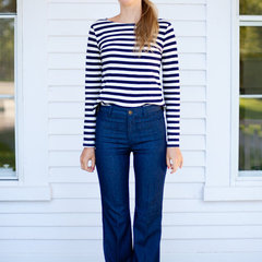
Don't know if you noticed, but the blog has a new look! I am thrilled with the finish product: the chevron and lattice patterns, the color palette, and the fonts. Erin from Designer Blogs executed my vision to perfection!
She made sure I was completely happy with the design - even if it meant changing fonts three times. She responded to emails and my requests immediately, and the whole thing was completed in just under 5 days; it would have been less, but I held up the show because I wanted the design to marinate before I made any decisions. If you are ever considering a blog face lift, she is your gal!
As the blog makeover suggests, I am pretty serious about continuing Glam Granola as a space to share our successes - and pitfalls - as we embark on home ownership and attempt to update our first home. It allows me to share the ideas swirling around in my head, get feedback from you on whether I am heading in the right direction, as well as share recipes and fashion trends that keep my belly full and my heart a-flutter.
So (big deep breath as I put myself out there), if you are liking what you see over here at GG please leave me a comment, become a follower, or even spread the word. Because my favorite part of this blogging experience so far is hearing from all of you, and even meeting some virtual friends whose own blogs - and homes - I have been admiring for the better part of a year. I hope GG can be a space where these conversations continue! (Maybe even until we look like this?)
Thanks for reading and being a part of this adventure with me!
Monday, January 31, 2011
Friday, January 28, 2011
Current Casa: Kitchen
Forgive me for forgoing Fashion Friday this week. I wanted to continue the home tour with the kitchen. Unlike the baño, the kitchen is the room we did the least to because it was in the best shape when we moved in.
And this dishwasher, which has been a marriage-saver. You can catch a glimpse of it on the left in the pic below.
We did have some big plans for it that never came to fruition, as you can see from the paint swatches on the wall. Only we never quite pinned down the perfect paint color... We had also wanted to replace the disgusting linoleum and we talked about repainting the cabinets. There was just too much white everywhere for our taste, and that floor! Don't even get me started.
But someone else will have to give this kitchen an overhaul. As it turns out, we have another stuck in the 70's kitchen calling our name. More on that to come...
What about you? Is there a room makeover just calling your name that you haven't gotten to yet? Or is it just us?
Thursday, January 27, 2011
Current Casa: Bathroom
This room might just be my favorite room of the house because it is the most finished. It's also light and bright, and the soothing colors work together well.
Here's the view from the door. The curtains are no-sew curtains that I made using Young House Love's tutorial. The fabric is from Waverly's Sun N Shade Line, an indoor/outdoor line of fabrics that I thought would stand up well to a moisture-rich room like the bathroom. The pattern is Lovely Lattice in Lagoon. It truly lives up to its name!
And below is the view of the vanity, which we scored from one of the hub's former jobs. It replaced a hideous dark brown vanity that had some kind of weird faux brown marble countertop. Ick. I was so grossed out at the time that I didn't take any "before" pics, but now I wish I had.
We also re-tiled with cream porcelain tiles and grey grout. The tiles look great for about a day after the bathroom gets clean, but they get dirty quick. I am not sure if we would go this route again. I would and will do the baseboard again. It really makes the room feel finished.
The towels are Thomas O'Brien's Vintage Modern line for Target, and the soap pump hails from Tar-jay as well. To the left of the soap pump is an abalone shell that I use to hold hair ties, tweezers, etc. Weird, but it works for us.
The shower curtain is a Marimekko print that we got from Crate and Barrel years ago on clearance. I absolutely love it and am sad that we will have to pack it away - for at least a little while - till we can do something about our sliding shower doors in the new house.
Above the toilet is some art.
The top print comes from Michelle Brusegaard's etsy shop. She designed our wedding invites. I love them so much that I periodically drop in on her shop to see what is new, which is how I found this picture of birds on a wire, called "Pretty Birds." I adore the parallel lines cutting across the picture plane, the color scheme, and how it all plays off of the more curvy lines of the print below, cut from a Snow and Graham calendar from years past. (Please excuse the art historian in me.)
And this is decidedly not glam, but on top of our toilet tank sits a silver hammered tray with shells collected from vacations, a cute matchbox, and a scented candle.
Here's the view from the door. The curtains are no-sew curtains that I made using Young House Love's tutorial. The fabric is from Waverly's Sun N Shade Line, an indoor/outdoor line of fabrics that I thought would stand up well to a moisture-rich room like the bathroom. The pattern is Lovely Lattice in Lagoon. It truly lives up to its name!
And below is the view of the vanity, which we scored from one of the hub's former jobs. It replaced a hideous dark brown vanity that had some kind of weird faux brown marble countertop. Ick. I was so grossed out at the time that I didn't take any "before" pics, but now I wish I had.
We also re-tiled with cream porcelain tiles and grey grout. The tiles look great for about a day after the bathroom gets clean, but they get dirty quick. I am not sure if we would go this route again. I would and will do the baseboard again. It really makes the room feel finished.
The towels are Thomas O'Brien's Vintage Modern line for Target, and the soap pump hails from Tar-jay as well. To the left of the soap pump is an abalone shell that I use to hold hair ties, tweezers, etc. Weird, but it works for us.
The shower curtain is a Marimekko print that we got from Crate and Barrel years ago on clearance. I absolutely love it and am sad that we will have to pack it away - for at least a little while - till we can do something about our sliding shower doors in the new house.
Above the toilet is some art.
The top print comes from Michelle Brusegaard's etsy shop. She designed our wedding invites. I love them so much that I periodically drop in on her shop to see what is new, which is how I found this picture of birds on a wire, called "Pretty Birds." I adore the parallel lines cutting across the picture plane, the color scheme, and how it all plays off of the more curvy lines of the print below, cut from a Snow and Graham calendar from years past. (Please excuse the art historian in me.)
And this is decidedly not glam, but on top of our toilet tank sits a silver hammered tray with shells collected from vacations, a cute matchbox, and a scented candle.
This bathroom is so much more spacious and airy than our new baños that it will be sorely missed. But I imagine that there is nothing quite like having two of them! I'll get back to you in a couple weeks on that one...
Wednesday, January 26, 2011
Current Casa: Living Room
This past weekend, I realized that I was cleaning and straightening our house for the last time before we move. Yes, I will still vacuum, mop, scrub toilets and sinks, and dust before we move, but now that I have starting packing, our house really won't look like it did when we lived here. (Sad face.) So after the weekly clean, I decided to snap some pictures of our current casa for posterity's sake. Also, I thought I should post a little house tour before we move.
My disclaimer is that this home never felt finished. There was always something I wanted to tweak, replace, or refinish; but since it was a rental, that was really not an option.
Let's start in the living room. Some of these pics should be familiar from my sofa post from earlier in the week. Here's the view when you walk in the front door.
Yep, this is normally where you will find the pups... if they are not following us around, begging us to take them outside to play.
Here's a view facing the fireplace, with a close up of the mantel scape below. The fossils were found at a jobsite I worked on in Texas.
To the left of the fireplace is the sofa, and across from that is a lovely built-in bookshelf that we will miss dearly.
I wish the books were organized like Megan's from Honey We're Home, but maybe I will get my act together in the new casa - once we figure out where to put all those books, CD's and DVD's!
Just right of the built-in is a sideboard that showcases our only wedding photo (read all about that here), as well as our wedding guest book, album, and framed invite.
This is the view from the door, which looks straight down the hallway to the bedrooms and the bath.
And here's the tower opposite the fireplace. Something needs to happen with that piece... Oh, and please don't mind the boxes.
So there's the living room. Stay tuned for the kitchen and bathroom later this week.
Tuesday, January 25, 2011
All In The Name of Progress
Things are clipping right along over here as we approach closing, so I thought it was time that I give an update on our progress.
We close in 10 days! Whew, a 25 day escrow sure does move fast! We passed all of the inspections - home, water, city, soil - as of last week. And the terrific news is that the house appraised at well over our accepted offer amount. So even though it feels like we will be in the red in ten days, really we will be in the black. Gotta remind myself of that when we starting writing out those mortgage payments.
Should the picture, courtesy of http://montrealrealestateblog.com/understanding-the-home-appraisal-process/, be the other way around?
We will be signing the papers with the title company at the end of this week, the property should be recorded by the middle of next week, and we can pick up the keys on Friday. Craziness! Just to add an extra layer of insanity, I will be in Southern California at a conference on the day we close, so the hubs is going to have to get keys.
That weekend, while all of you are doing this:
We will be doing this:
Only picture Ryan and I.
Once the yard is ready to handle 200 pounds of fur and wagging tails we can move in. We are shooting for the weekend of the 12th. I don't know how the stars aligned for this one, but our slated moving weekend AND the following weekend are three day weekends for me. Thank you, dead presidents!
In packing news, I have three pretty sizable boxes packed. I know that doesn't sound like much, but it is all the kitchen items we won't need in the next three weeks, as well as all our china and about half our stemware. I was hoping to be farther along by this point, but meh, what can you do? I gotta keep my day job. I'll try to update with some pictures of our dining room where all the packing is going down. It looks like a tornado hit!
Lastly, our little rental has found new people to house. I am so happy that our first casa together has a new couple to love it as much as we did in our six + years here. And so the cycle continues...
We close in 10 days! Whew, a 25 day escrow sure does move fast! We passed all of the inspections - home, water, city, soil - as of last week. And the terrific news is that the house appraised at well over our accepted offer amount. So even though it feels like we will be in the red in ten days, really we will be in the black. Gotta remind myself of that when we starting writing out those mortgage payments.
Should the picture, courtesy of http://montrealrealestateblog.com/understanding-the-home-appraisal-process/, be the other way around?
We will be signing the papers with the title company at the end of this week, the property should be recorded by the middle of next week, and we can pick up the keys on Friday. Craziness! Just to add an extra layer of insanity, I will be in Southern California at a conference on the day we close, so the hubs is going to have to get keys.
That weekend, while all of you are doing this:
www.nfl.com |
We will be doing this:
Image courtesy of Habitat for Humanity |
Once the yard is ready to handle 200 pounds of fur and wagging tails we can move in. We are shooting for the weekend of the 12th. I don't know how the stars aligned for this one, but our slated moving weekend AND the following weekend are three day weekends for me. Thank you, dead presidents!
In packing news, I have three pretty sizable boxes packed. I know that doesn't sound like much, but it is all the kitchen items we won't need in the next three weeks, as well as all our china and about half our stemware. I was hoping to be farther along by this point, but meh, what can you do? I gotta keep my day job. I'll try to update with some pictures of our dining room where all the packing is going down. It looks like a tornado hit!
Lastly, our little rental has found new people to house. I am so happy that our first casa together has a new couple to love it as much as we did in our six + years here. And so the cycle continues...
Monday, January 24, 2011
Couching the Issue
I have a couch conundrum. I love our green velvet sofa in our current living room.
It works so well with the ochre walls, the warm wood furniture, and other pops of black, white, green, and orange. The burnished color reads almost as a neutral, really warming up the light-filled space. (Not that you can tell from my crappy photos. Looks like a new camera needs to be added to the wish list.)
However, in our new casa, whatever color we paint the walls in our living area will essentially carry through three pretty sizable rooms: the kitchen, dining room, and living room. And I think that my beloved ochre - Marblehead Gold by Benjamin Moore - will be a bit too much in so large a space.
So the question is: What wall color should we use to complement the green sofa? We are thinking that a neutral - specifically a muddy greige - will work in our large and lofty living area, without competing with the sofa.
Making It Lovely totally validated the present color scheme here:
Notice the warm wood furniture, rich ochre color of the bedding and the art, and accents in black and white.
And luckily for me, they also confirmed that my emerging color scheme is heading in the right direction here:
The warm grey is a bit darker than I imagined, but is definitely in the same color family. And even though Marblehead Gold won't be the star of the show anymore, she can still play a supporting role. I envision her grounding the room in the form of a bold, geometric patterned rug like this one from from Garnet Hill in Yellow.
The first pic is for Better Homes and Gardens' October issue. (Sorry for the grainy quality. My scanner sucks. Guess that needs to be added to the list too.) And I believe the second pic is from Rue, or maybe Lonny.
What are your thoughts? Am I headed in the right direction?
It works so well with the ochre walls, the warm wood furniture, and other pops of black, white, green, and orange. The burnished color reads almost as a neutral, really warming up the light-filled space. (Not that you can tell from my crappy photos. Looks like a new camera needs to be added to the wish list.)
However, in our new casa, whatever color we paint the walls in our living area will essentially carry through three pretty sizable rooms: the kitchen, dining room, and living room. And I think that my beloved ochre - Marblehead Gold by Benjamin Moore - will be a bit too much in so large a space.
So the question is: What wall color should we use to complement the green sofa? We are thinking that a neutral - specifically a muddy greige - will work in our large and lofty living area, without competing with the sofa.
Making It Lovely totally validated the present color scheme here:
Notice the warm wood furniture, rich ochre color of the bedding and the art, and accents in black and white.
And luckily for me, they also confirmed that my emerging color scheme is heading in the right direction here:
The warm grey is a bit darker than I imagined, but is definitely in the same color family. And even though Marblehead Gold won't be the star of the show anymore, she can still play a supporting role. I envision her grounding the room in the form of a bold, geometric patterned rug like this one from from Garnet Hill in Yellow.
And just for fun, here's some more eye candy featuring green sofas:
The first pic is for Better Homes and Gardens' October issue. (Sorry for the grainy quality. My scanner sucks. Guess that needs to be added to the list too.) And I believe the second pic is from Rue, or maybe Lonny.
What are your thoughts? Am I headed in the right direction?
Friday, January 21, 2011
Fashion Friday: Emerson Made
I am having a *moment* with Emerson Made. I want to snatch up everything they make! I could really wax poetic about them...
Since I can't do their crisp and chic clothes and accessories justice in one post - they just released their spring line! - today I thought I would focus on what first caught my eye: their striped shirt, trouser jeans, and fun flowers.
The combination feels absolutely fresh and perfectly spring-y!
When stripes hit the stores I know spring is just around the corner. I guess it's like my version of Groundhog Day. And stripes are everywhere this year in different colors and silhouettes!
(First and third image from J. Crew, Saint James naval II tee and Sailor Sweater respectively, and second image, Every Saturday Tee, from Anthropologie.)
So are trouser jeans. The wide, bell leg is so flattering and comfortable, and unlike my favorite skinny jeans that I have been running around in of late, the high waist means you don't have to worry about unwittingly flashing a little crack.
I am loving the flare on those Emerson Made Blue Bells. Just wish I could afford them! J Brand's Seline Trousers (the second pic, available at Anthropologie) offer a similar look for significantly less. But, oh! The sheen on that Emerson Made denim! I think I might just have to get a piggy bank...
What are you saving up for fashion-wise these days?
Thursday, January 20, 2011
Light My Fire
You may have noticed a certain bright blue candle lurking in the corner of my mantel post from yesterday.
Or maybe not. (Here's when I wish I knew Photoshop so I could draw in a giant arrow pointing right to it.)
I am obsessed with Capri Blue candles from - where else but? - Anthropologie. My absolute favorite is the Volcano scent.
It's a light combination of citrus and floral that builds as it burns, but is never too heady or overpowering. People always remark that our house smells so good whenever we have one burning, which says a lot since Ridgebacks are known for their odoriferous flatulence. (It just sounds less crass when you use big words.)
For awhile, they just offered the Volcano scent in a blue or red glass jar. But recently they have been branching out and now offer more scents in different kinds of containers.
We have the Island Orchid in our bedroom. It smells just like Hawaii and makes me want to book a flight back ASAP every time I walk by it. Has it really only been six months? Is it summer yet?
They also have an African Jasmine that I have yet to smell, but I love the coral glass.
And check out the cool mercury glass, which is definitely a hot trend right now, and the stamped glass look of the last one.
At 28 bucks a pop, they are more expensive than the candles from Tar-jay, but they burn three to four times as long. Trust me, these babies last forever! And did I mention they make great gifts for the gal that has everything?
Wednesday, January 19, 2011
Confessions of a Bad Bride
I have a confession to make: we only have one picture from our wedding printed and framed in our home, and it was taken by my dad, not our photographer. It's not because we don't want pictures. We do. And in our defense, we actually placed an order with a local camera shop, which they promptly lost. It took us so long to decide which pics and what sizes we wanted that we haven't had the motivation to sit down again and try to recreate our original order.
But one thing we have done is create some meaningful artwork out of our wedding vows.
The heart in the middle has our names, our wedding venue, and the date. (Yes, our wedding was two and a half years ago and we still haven't ordered photos! I know, I know...) Around the heart are our wedding vows, including the Apache Wedding Blessing that concluded the ceremony and inspired our choice for my processional, Ray LaMontagne's "Shelter." We both love the sweet reminder of the promises we made to each other in front of our loved ones - especially on those days when we try each other's patience.
In fact, we adore ours so much that we ordered one for our newlywed friends Lianna and Ethan from MySweetPrints' shop on Etsy.com. (Janette has lots of other lovely personalized prints and was a pleasure to work with, so please check her shop out!) Their ceremony was extra-special since it was written and officiated by our friend Jenny, so I thought the print would be even more meaningful for them.
But I digress. The light blue background complements our blue-grey walls (which look greenish in the photo), and the barn wood frame helps it from being too precious. The frame (from Michael's) complements the other art we have on our mantel.
It's a nude print by she hit pause studios that I became enamored of when I first saw it on Gilt Groupe. Luckily, I was able to score it on the she hit pause studio's Esty site for less than half the cost. The ethereal and moody nude is the yin to our wedding vow's yang. Gotta have some sweet and sultry in our master bedroom, right?
The good news is that all the mantel art and decor will find a new home on our currently hideous bedroom mantel, where I hope it will make that fireplace fade into the background.
What have you done with your wedding vows? Oh, and how long did it take you to order your wedding photos? (Please make me feel like less of a slacker here!)
Subscribe to:
Posts (Atom)